Waitly
Good things come to those who wait
Project
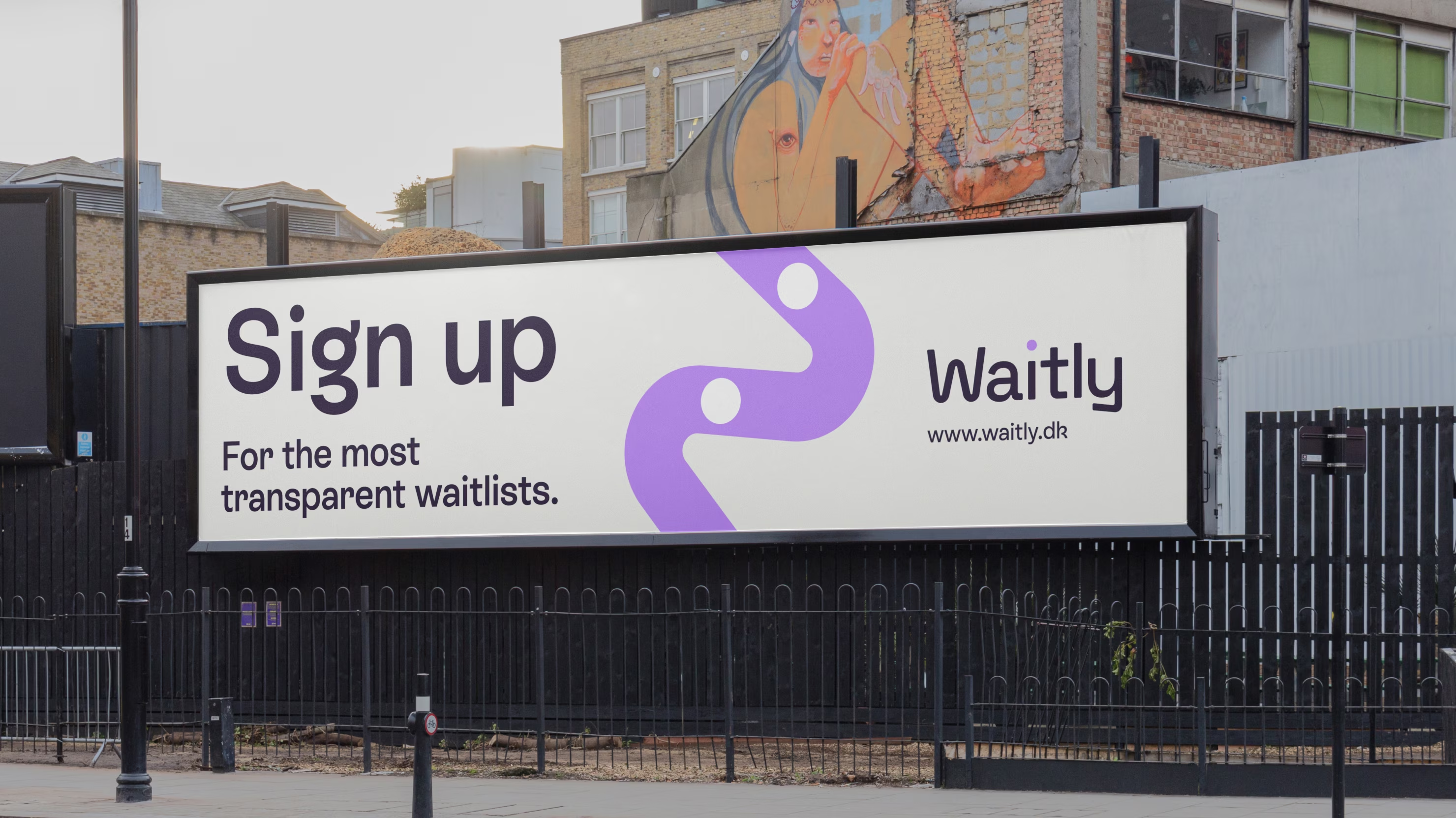
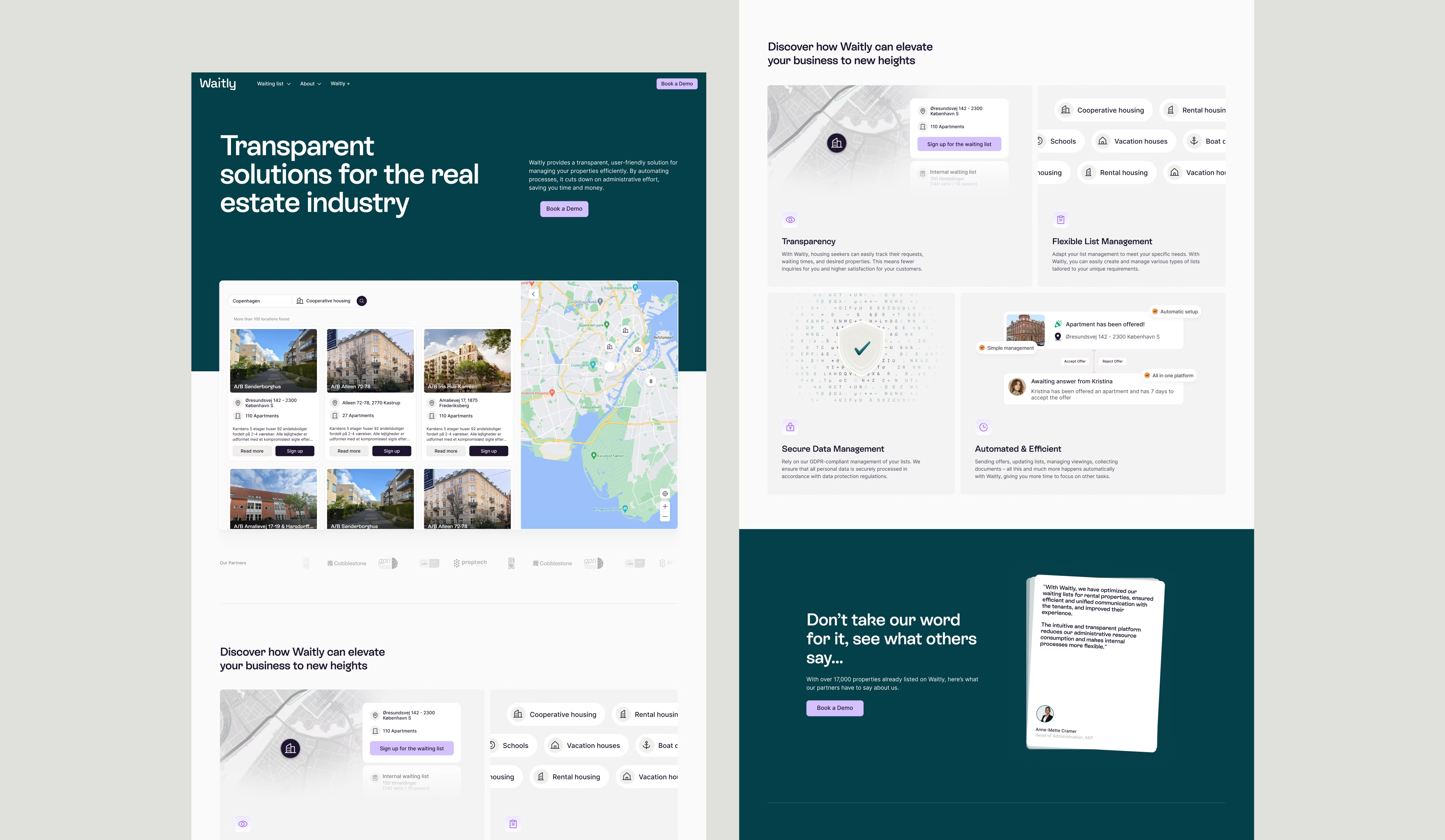
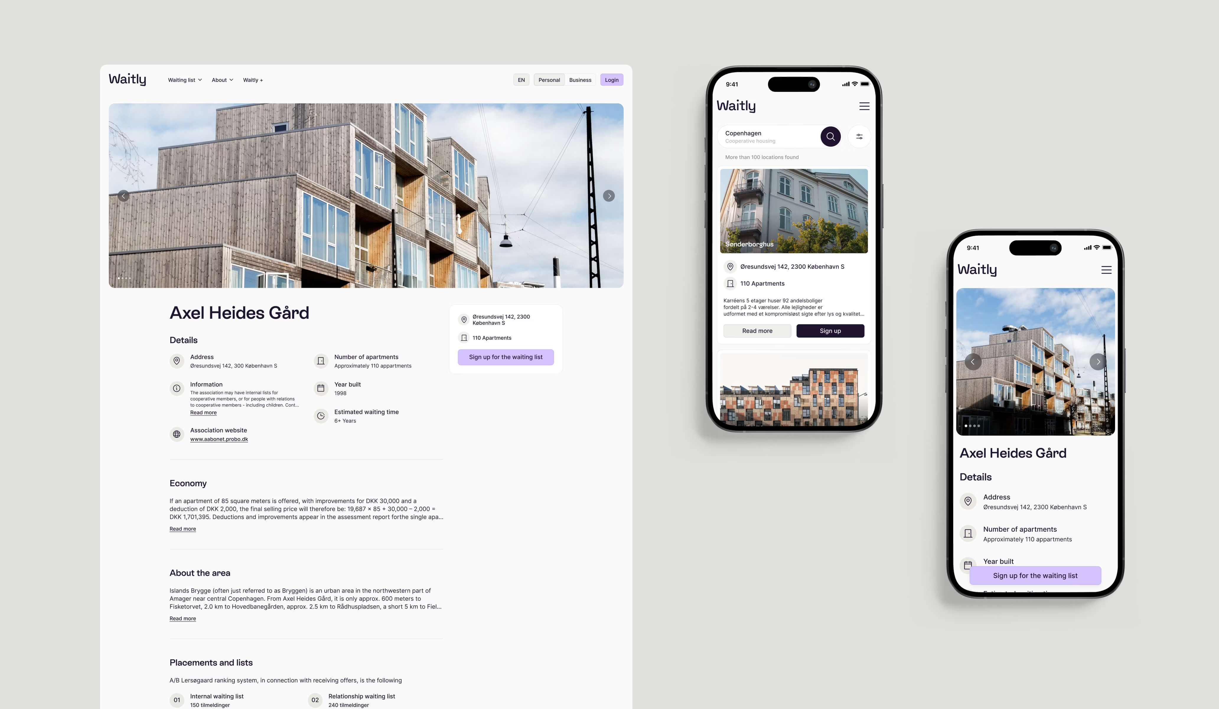
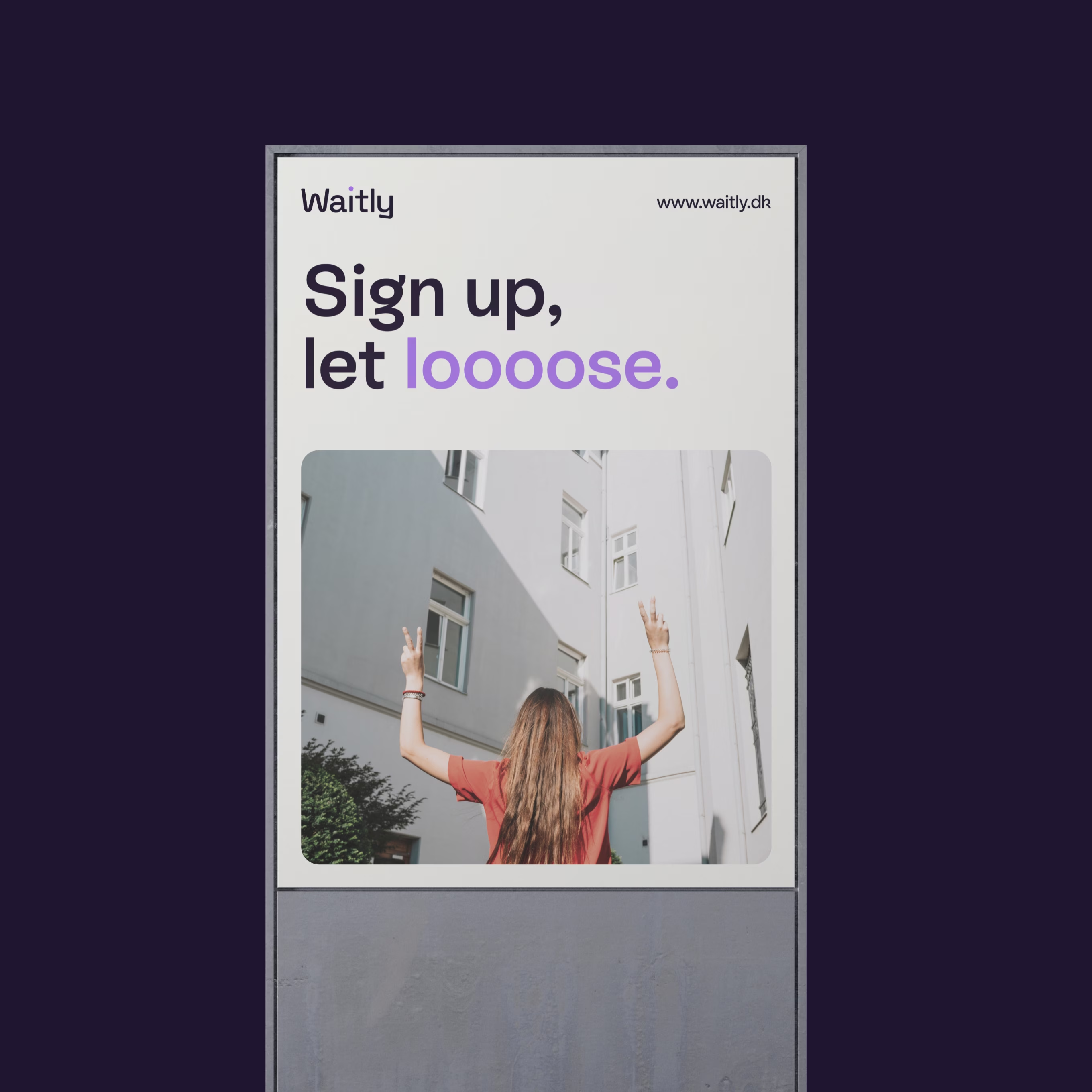
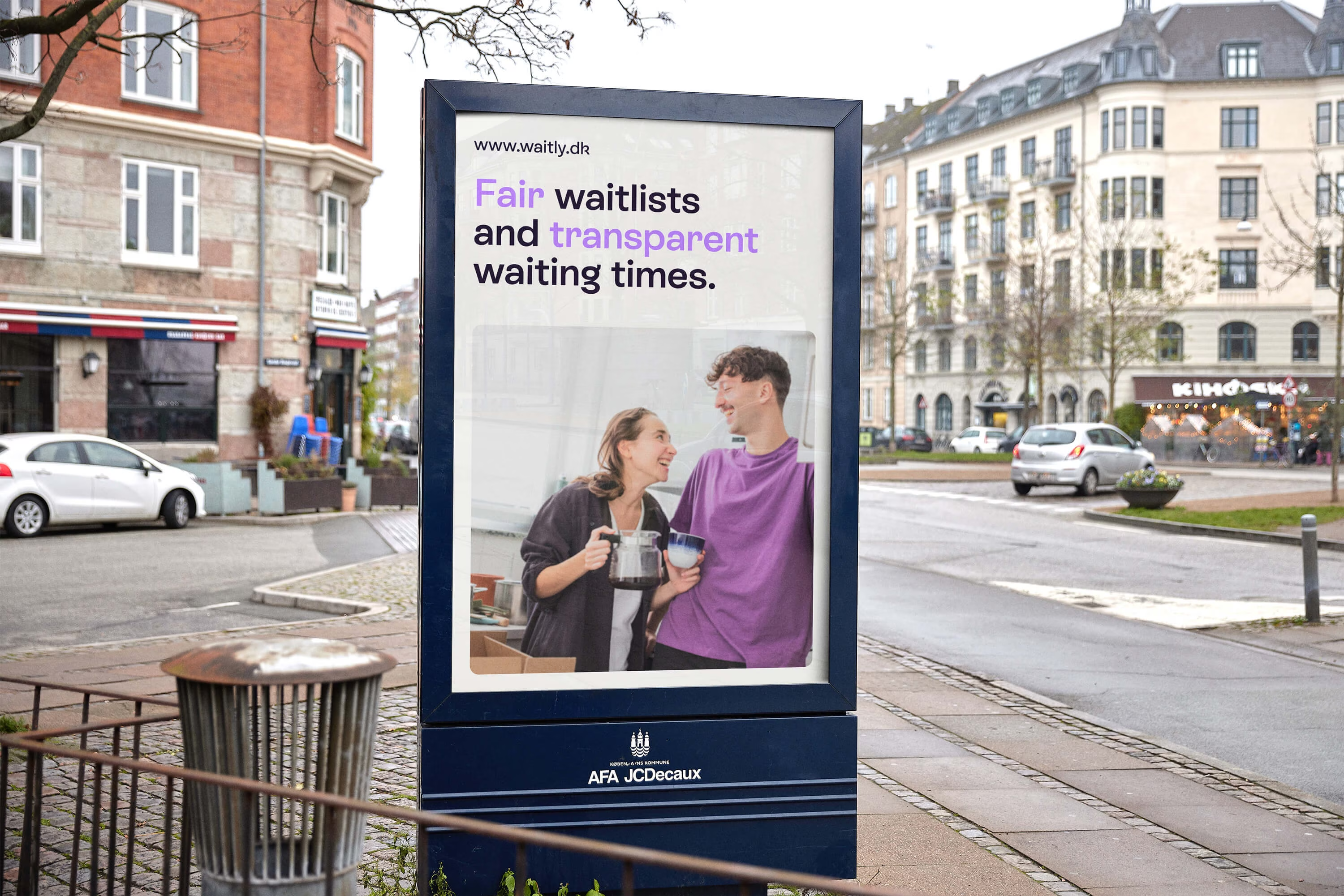
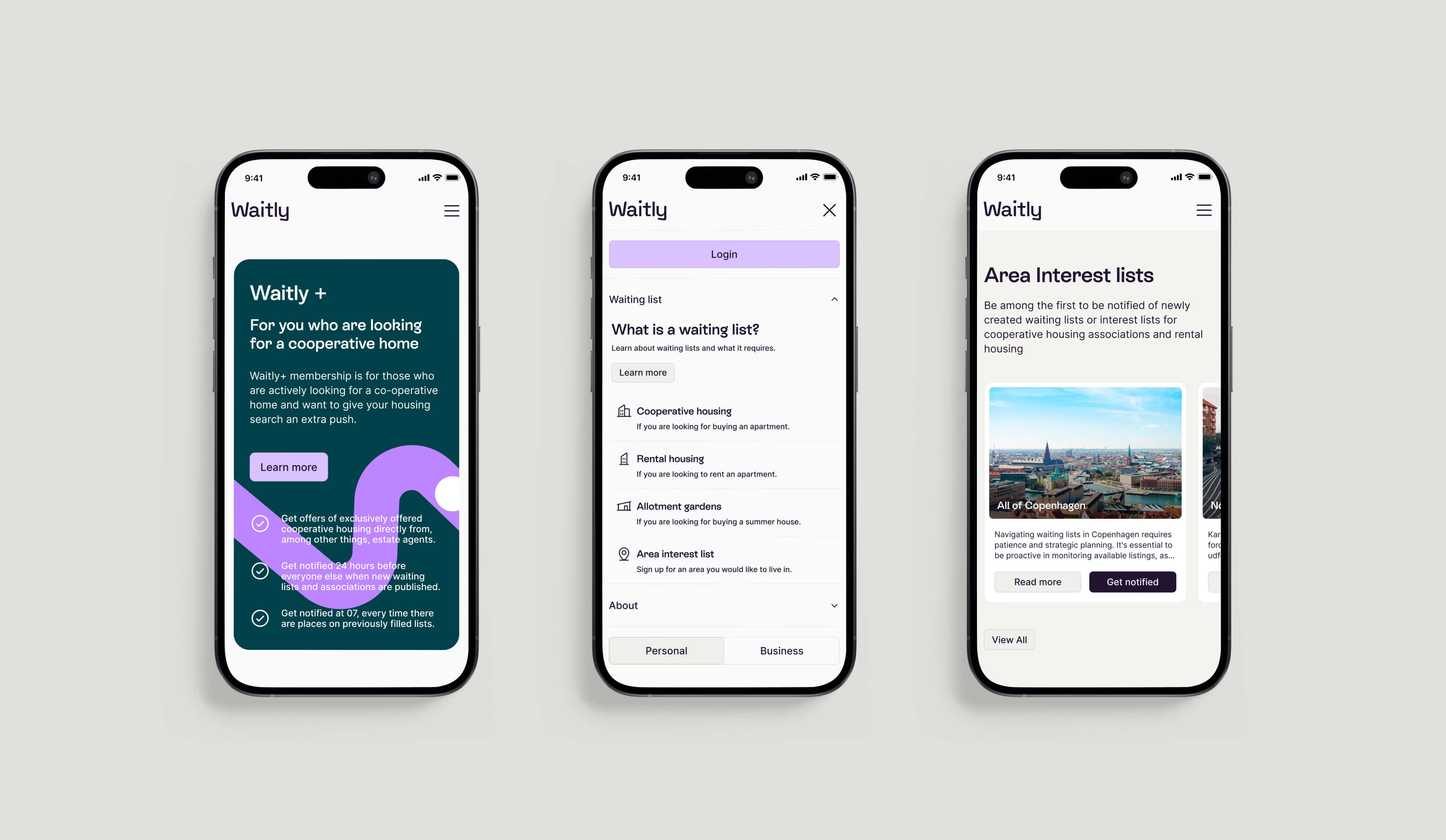
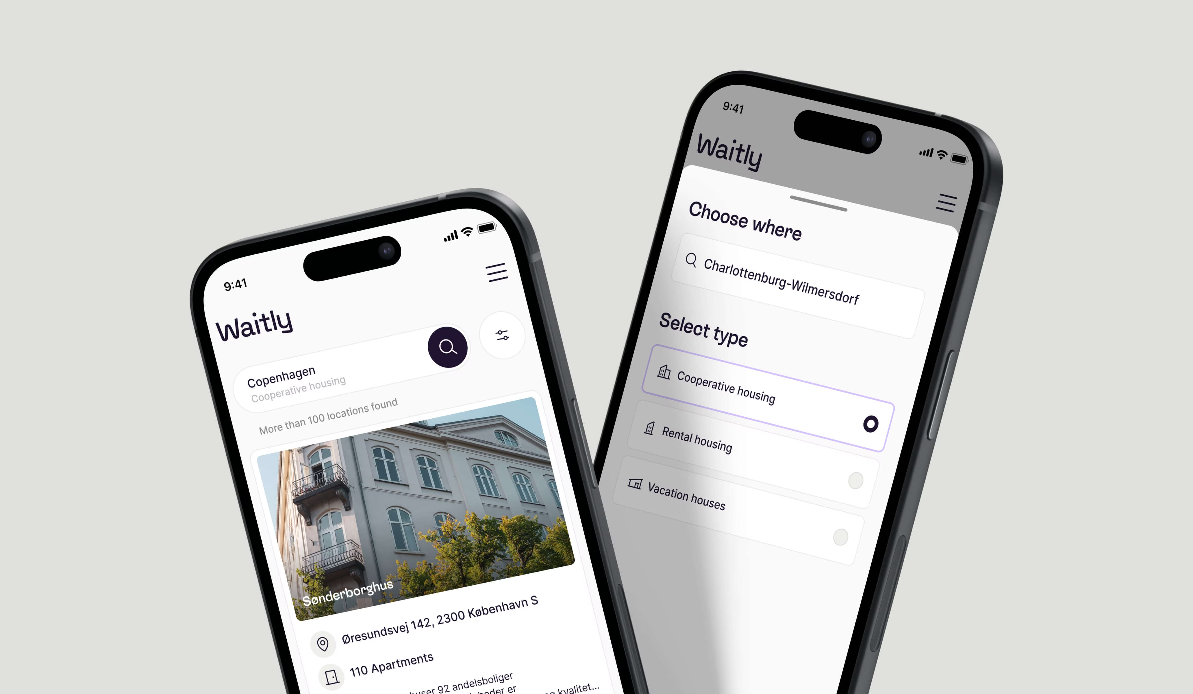
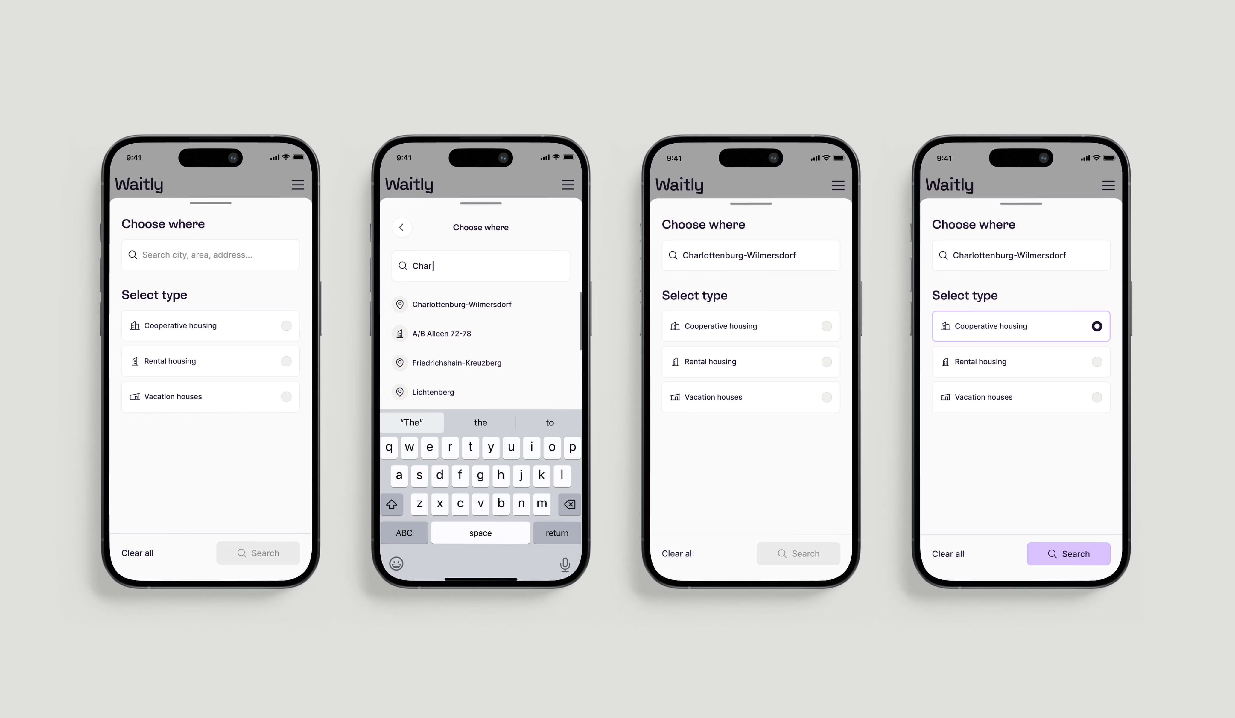
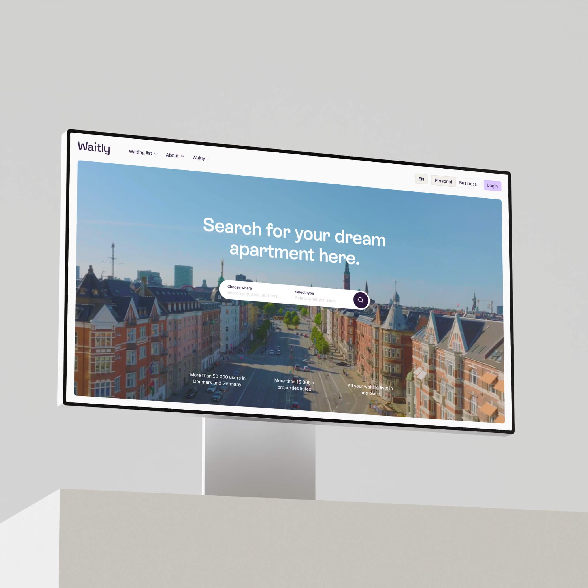
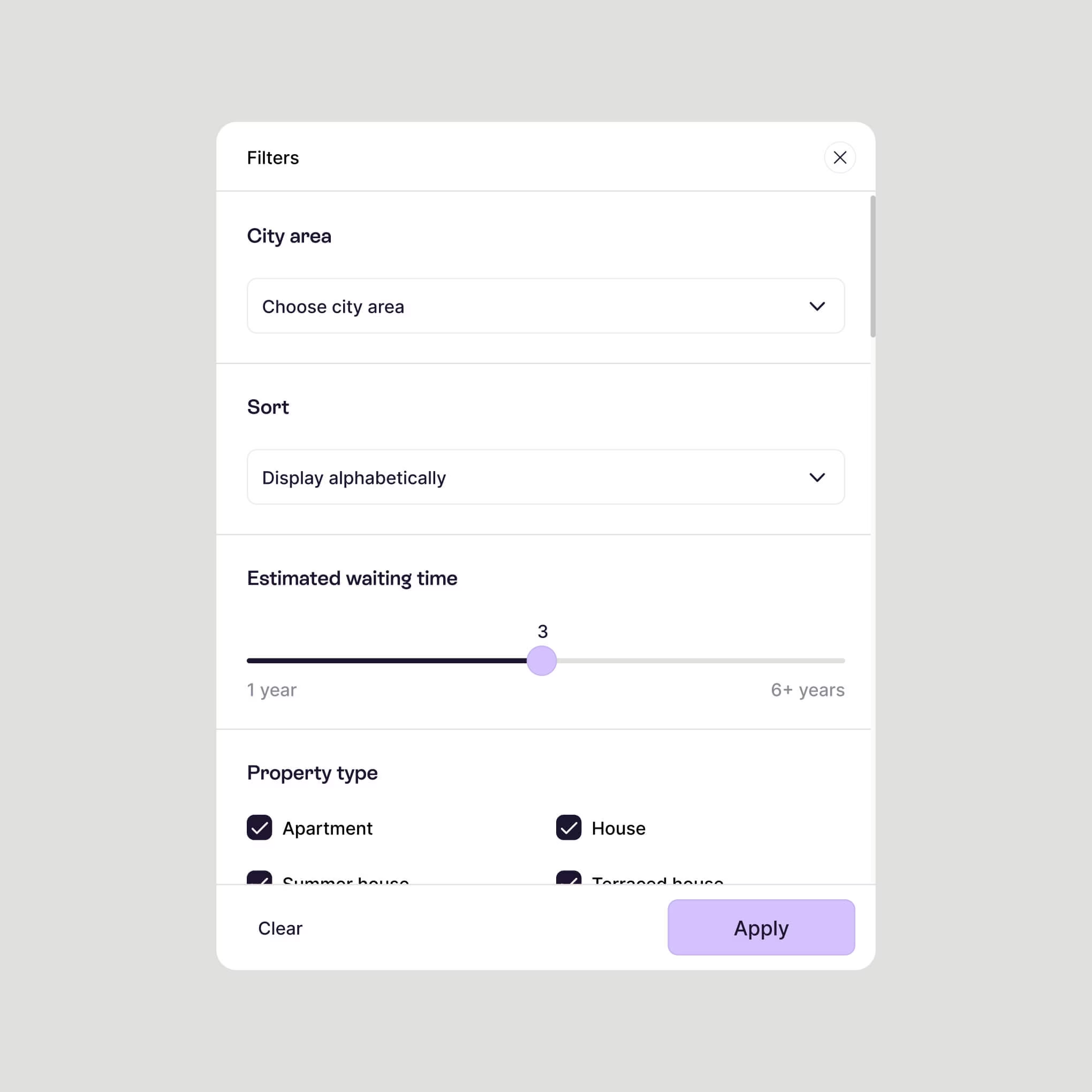
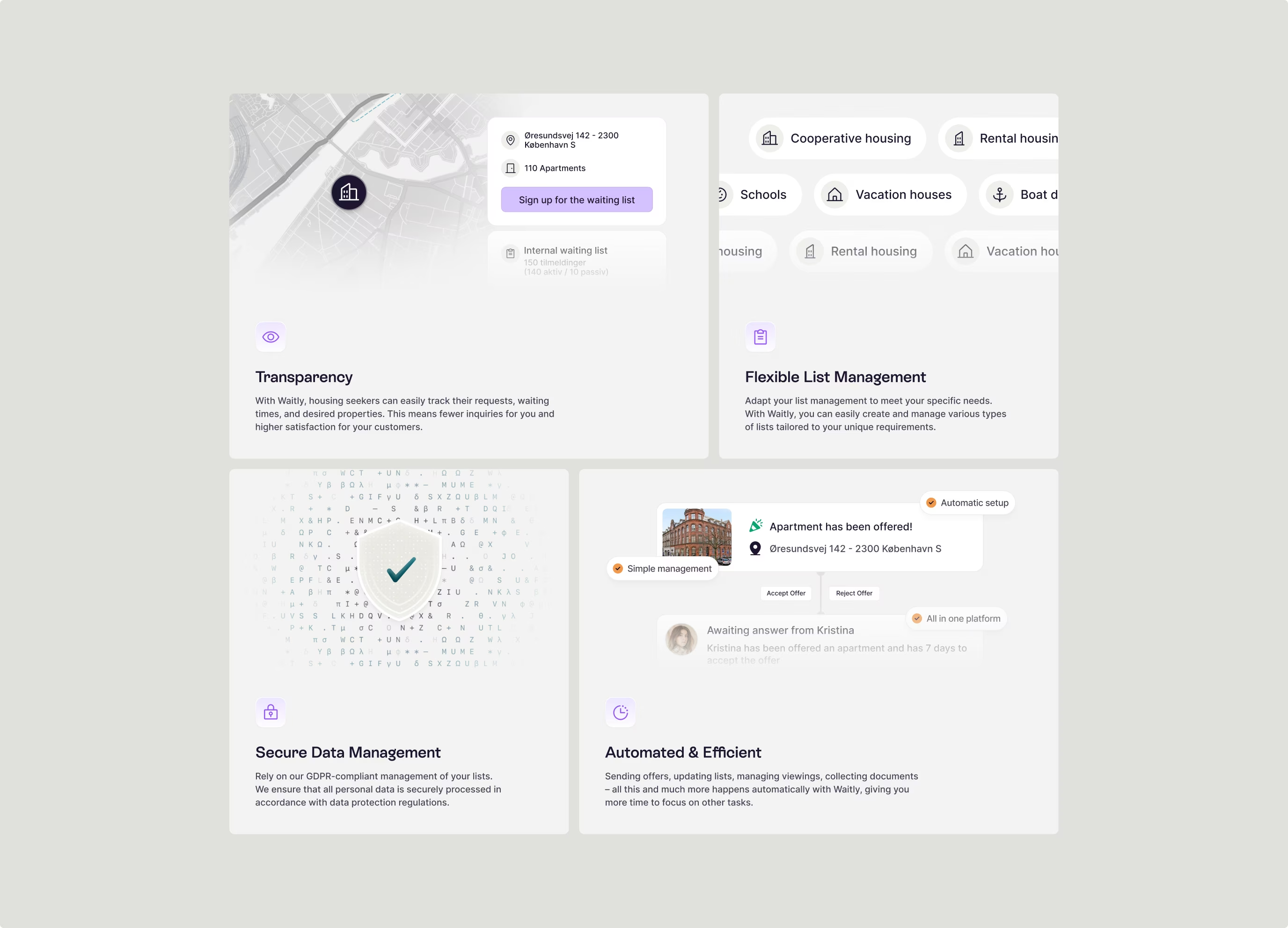
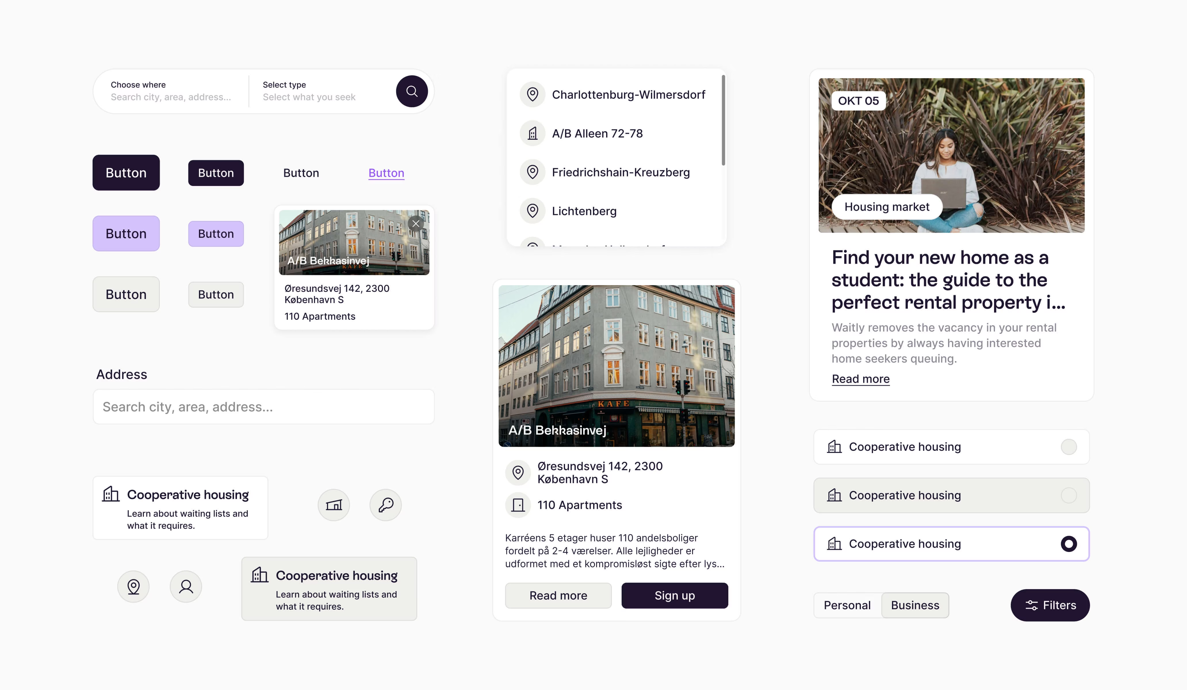
Waitly is a SaaS company that creates digital waiting lists. It began in the Danish housing market and is now expanding into Germany. As it entered new markets, the company wanted to update its brand so it could connect better with a younger audience and improve the digital experience.
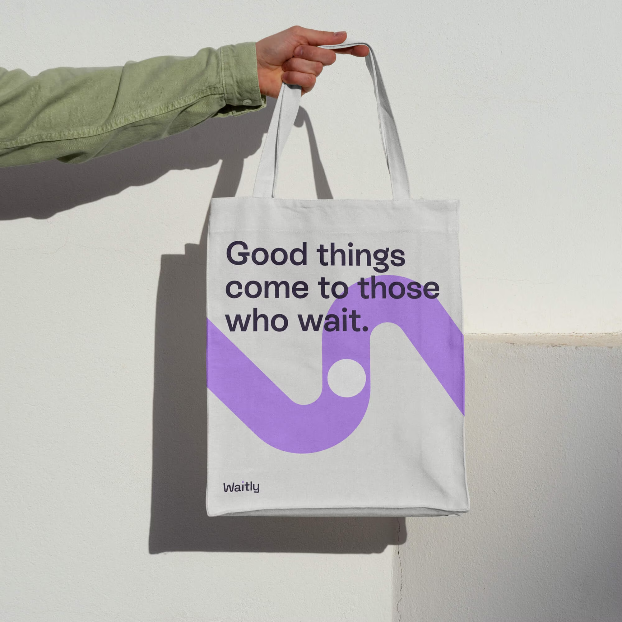
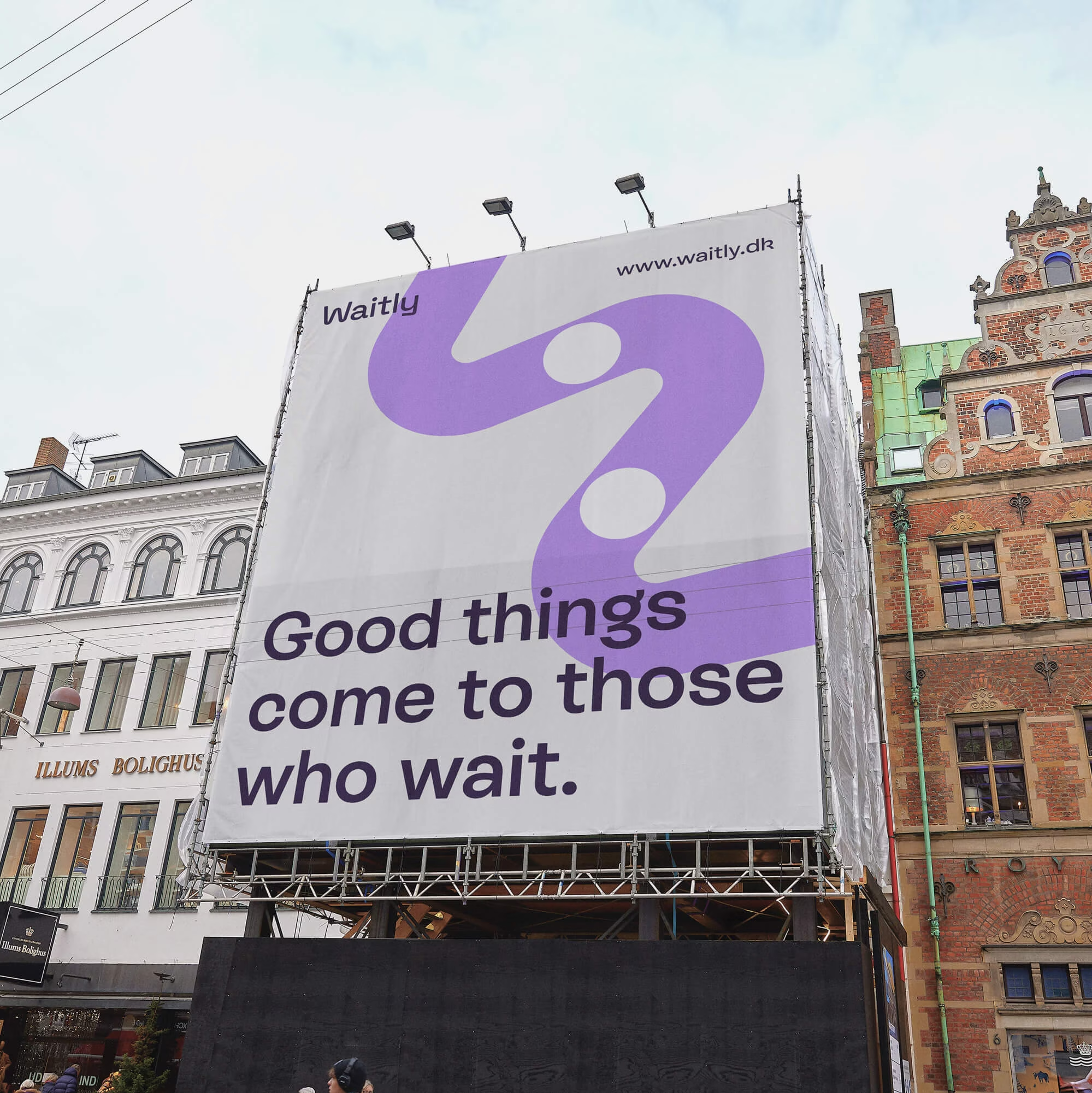
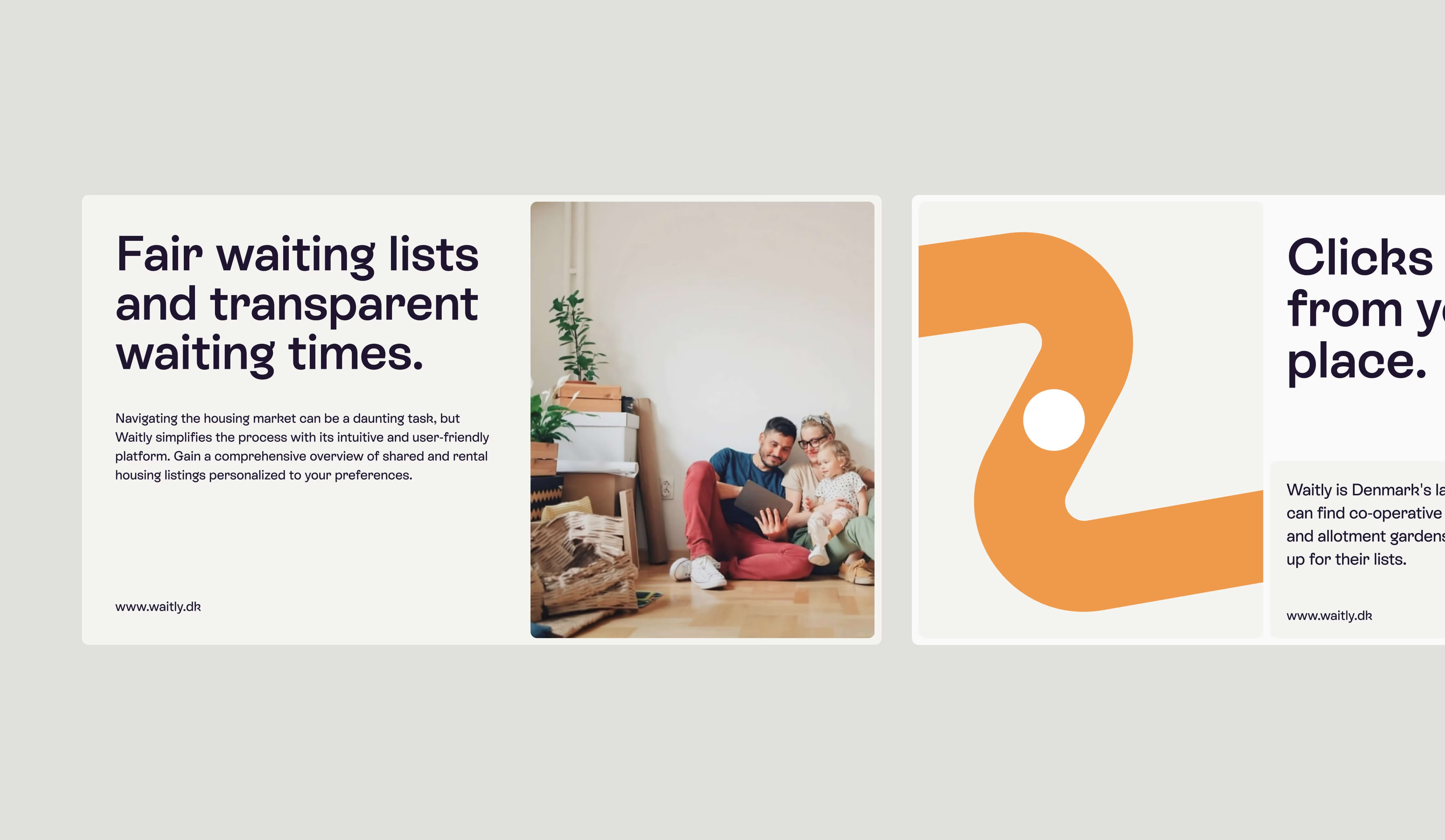
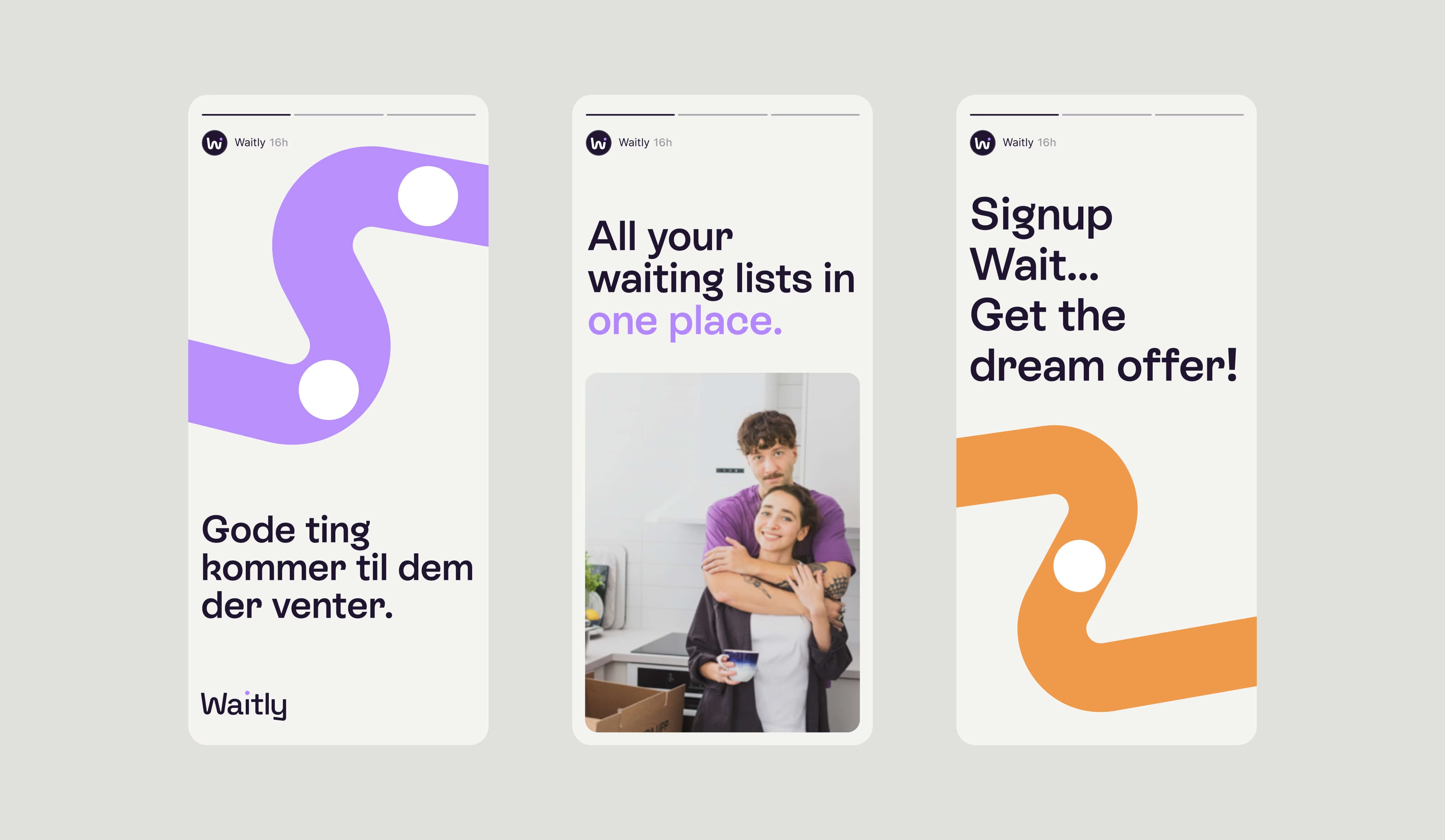
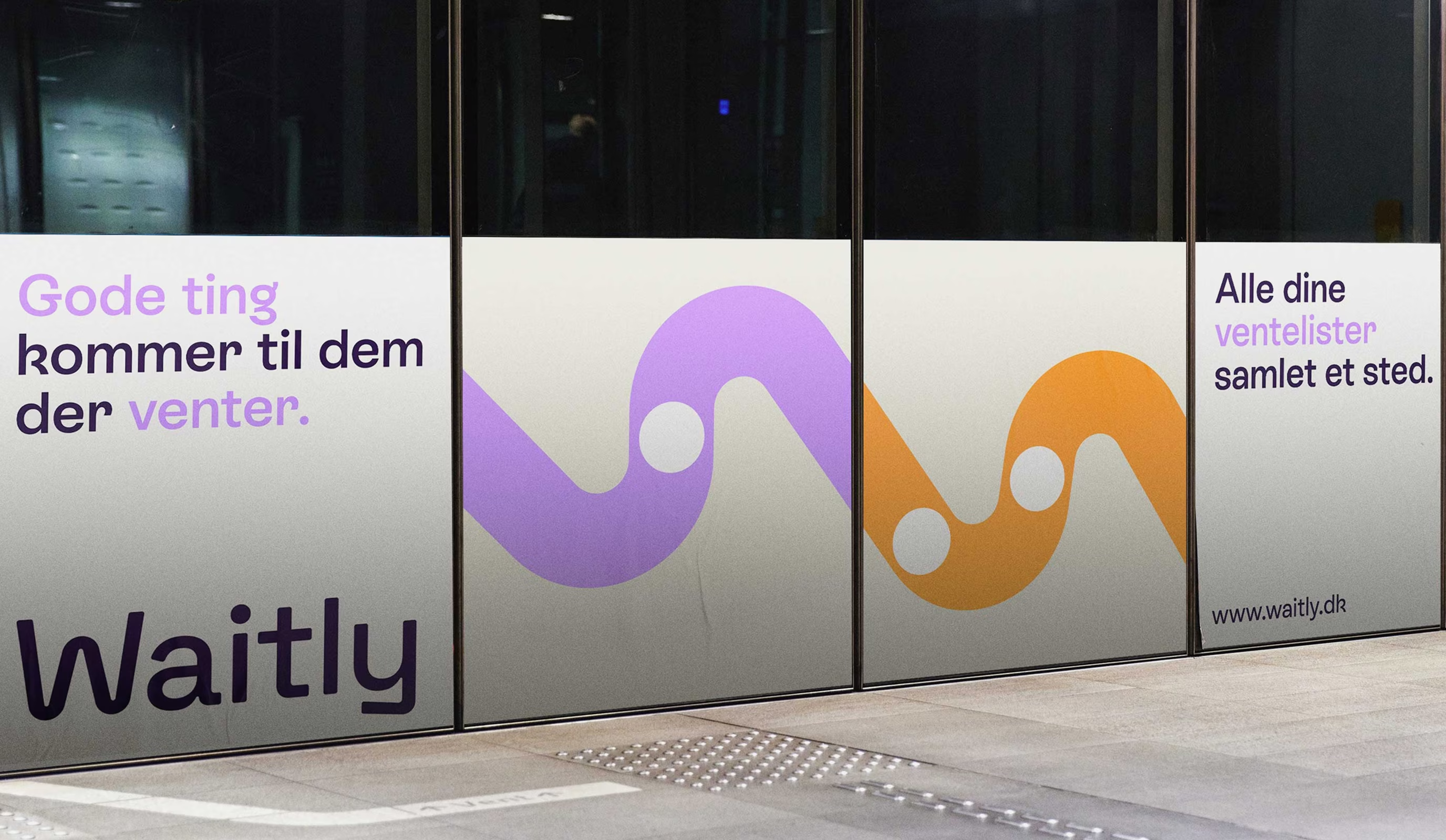
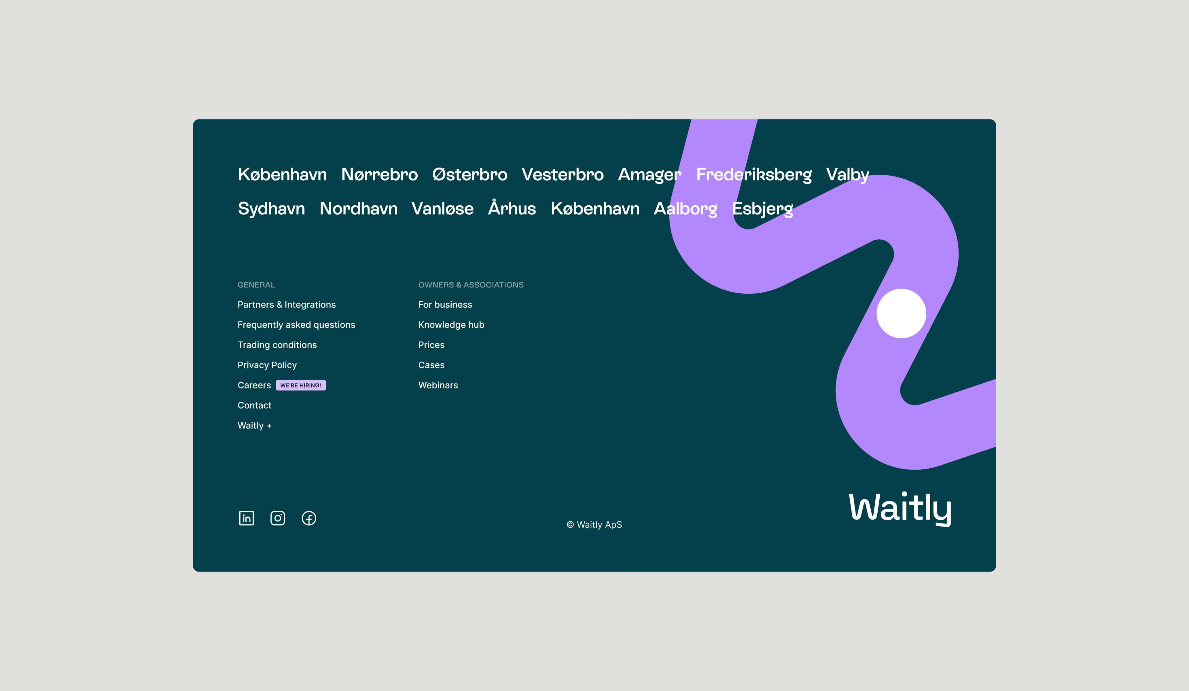
The result is a bright and playful identity. At its core is a focus on transparency, shown through the new “worm” symbol. This simple graphic illustrates a line of people waiting, with a single dot representing an individual, capturing the heart of what Waitly does.
Project completed at Signifly
Year
Delivery

Enquiries
Want to discuss a project?
Would love to hear about your company and how I can help.
Reply within 24h — Say hello ⮧
